
(No, this isn’t an article promoting AI art for book covers, so you can put away your torches and pitchforks.)
As an indie author, you’ve probably stared at your manuscript thinking, “Now what?” You’ve poured your heart into your story, edited until your eyes bleed, and formatted everything perfectly. Then comes the cover—that make-or-break first impression that can determine whether someone clicks “buy now” or scrolls past your masterpiece.
I get it. The pressure to compete with traditionally published books feels overwhelming, especially when you’re browsing Fiverr and seeing cover prices that make your wallet cry. But here’s something I’ve learned in my thirty years of graphic design: sometimes the most powerful covers aren’t the ones with elaborate illustrations or expensive photography. Sometimes, the magic happens when you let typography do the heavy lifting.
When Less Actually Becomes More
Consider the following two covers. Neither relies on complex artwork or painted scenes. Instead, they use bold, confident typography as their primary visual element, supported by simple but effective graphic elements.
These covers work because they understand something fundamental about book marketing: your cover needs to be readable and impactful at thumbnail size. When someone’s scrolling through Amazon on their phone, they’re seeing your cover at roughly the size of a postage stamp. Intricate artwork gets lost. Complex illustrations become muddy blobs. But strong typography? That cuts through the noise like a knife.
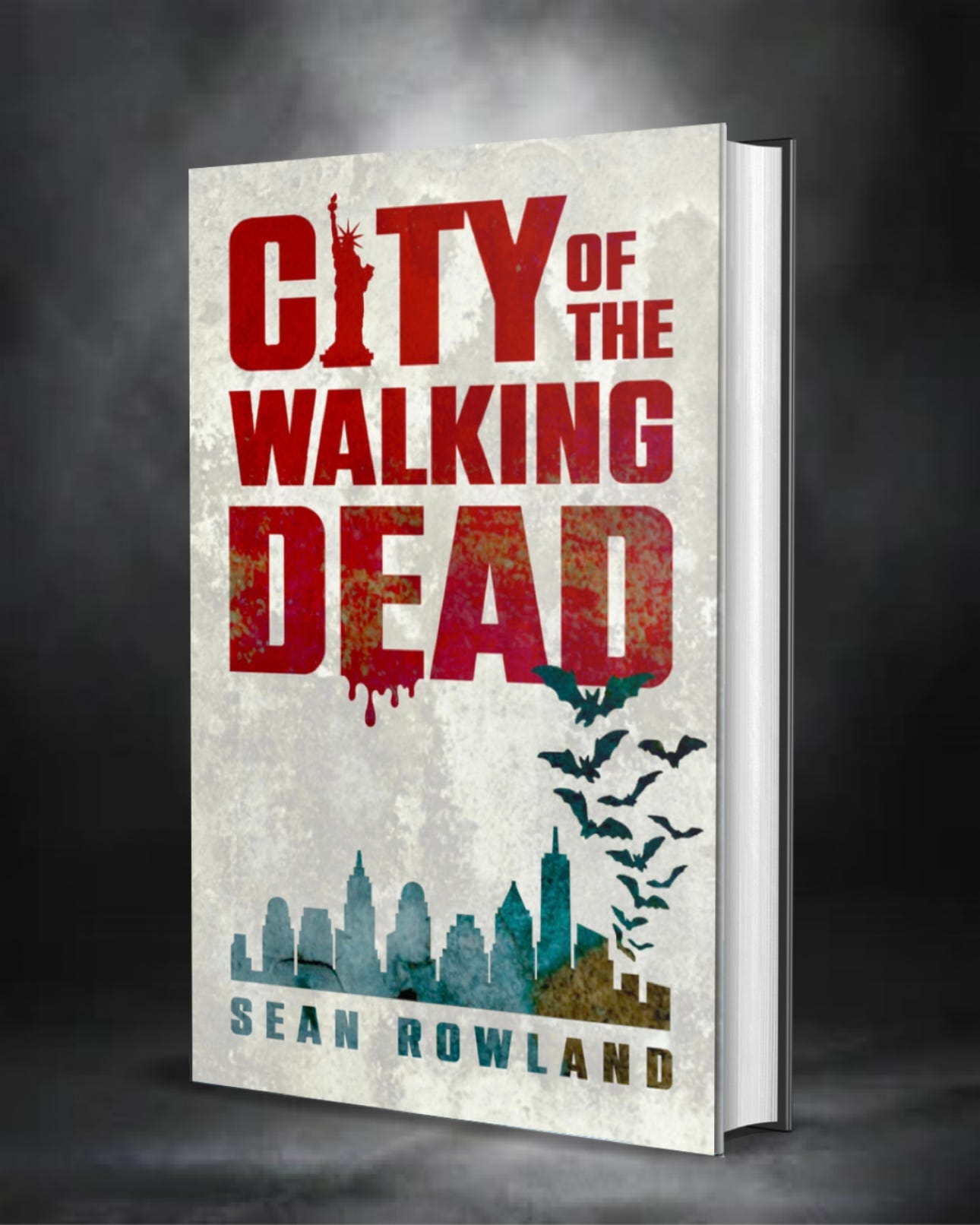
The “City of the Walking Dead” cover demonstrates this perfectly. The title dominates the design in bold red letters, with the word “DEAD” getting a distressed treatment that immediately communicates genre without needing a single zombie illustration. The Statue of Liberty silhouette in the “i” of “CITY” adds just enough detail to establish setting, while the urban skyline and bats provide atmosphere without cluttering the design.
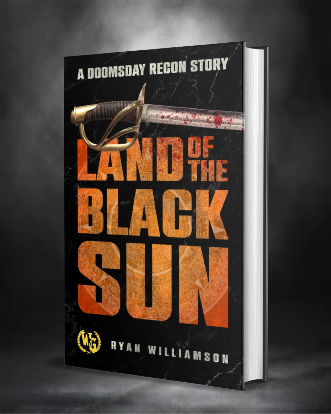
Similarly, “Land of the Black Sun” uses weathered, dimensional typography in orange against a stark black background. The sword graphic is simple but effective, and the overall design screams “adventure” and “danger” without needing to show a single character or scene.
Typography-First Covers Are Indie Gold
There are several reasons why typography-heavy covers can actually outperform expensive custom artwork, especially for indie authors:
Budget Reality: Let’s be honest—most indies aren’t working with Random House budgets. A professional cover artist might charge anywhere from $300 to $1,500 for a custom cover. When you’re testing the waters with your first book or working on a series, those costs add up fast. Learning to create effective typographical covers means you can produce professional-looking results for the cost of software and your time.
Series Consistency: If you’re planning a series, typography-based covers are much easier to make consistent. You establish your typographical style, color palette, and layout approach once, then adapt it across multiple books. Try maintaining that consistency with custom artwork, and you’ll quickly understand why major publishers stick to templates.
Speed and Flexibility: Need to make changes? With a typography-focused design, you can adjust colors, try different fonts, or tweak layouts in minutes. With custom artwork, you’re either stuck with what you have or paying for revisions.
Market Testing: Want to A/B test different approaches? Typography covers let you create multiple versions quickly to see what resonates with your audience.
Thanks for reading! Subscribe for free to receive new posts and support my work.
The Elements That Make Typography Covers Work
Successful typography covers aren’t just words slapped onto a background. They require understanding several key principles:
Hierarchy and Scale: Your title should be the dominant element, but not everything needs to be the same size. Create visual interest through varying text sizes, with the most important information (usually your title) getting the largest treatment.
Color Psychology: Both example covers use color strategically. Red communicates danger and urgency in the zombie thriller, while orange suggests adventure and action in the sword-and-sorcery tale. The colors also ensure the text pops against the background.
Texture and Treatment: Notice how both covers add visual interest to their typography. The distressed effects, dimensional treatments, and weathering make the text feel integrated with the genre rather than just floating on top.
Negative Space: Don’t try to fill every inch of your cover. Strategic use of empty space makes your typography more impactful and your cover easier to read at small sizes.
Resources for Learning Typography and Design
If you’re ready to dive into creating your own covers, here are the tools and resources that’ll get you started:
Software Options: Adobe InDesign remains the gold standard for typography work, but it comes with a monthly subscription fee. More budget-friendly alternatives include Affinity Publisher (one-time purchase), Canva Pro (great templates but limited customization), or even GIMP (free but with a steeper learning curve).
Typography Education: Start with “Thinking with Type” by Ellen Lupton—it’s the best introduction to typography principles you’ll find. Online, check out Typewolf.com for inspiration and Font Pair for combination suggestions.
Font Resources: Google Fonts offers hundreds of free, high-quality typefaces. For premium options, MyFonts and Adobe Fonts provide extensive libraries. When choosing fonts, consider licensing—make sure you have commercial rights for your book covers.
The Amateur Mistakes That Scream “Self-Published”
After three decades in design, I can spot amateur typography from across the room. Here are the mistakes that instantly mark your cover as unprofessional:
Times New Roman Disease: Please, for the love of all that’s holy, step away from Times New Roman. It screams “I didn’t even try.” The same goes for Arial, Comic Sans, and Papyrus. These fonts have their place, but book covers aren’t it.
Everything Centered: New designers love centering everything, but it often creates bland, static layouts. Try asymmetrical compositions, or at least vary your alignment.
Font Overload: Using seventeen different fonts doesn’t make your cover more interesting—it makes it look like a ransom note. Stick to one, maybe three fonts maximum, and make sure they complement each other.
Poor Contrast: If I have to squint to read your title, you’ve lost me. Ensure strong contrast between your text and background, especially for thumbnail viewing.
Neon: Just… don’t. Sure, it might offer contrast, but it’s eye-bleeding, not eye-popping
Ignoring Genre Conventions: Every genre has visual expectations. A romance novel and a horror story shouldn’t use the same color palette or typography style. Study covers in your genre to understand what readers expect.
Making It Work for You
The beautiful thing about typography-focused covers is that they level the playing field. You don’t need to be Michelangelo to create something effective. You need to understand your genre, respect the principles of good design, and be willing to iterate until you get it right.
Start simple. Choose a strong, genre-appropriate font for your title. Pick colors that communicate the right mood. Add one or two simple graphic elements if they enhance rather than distract. Test your design at thumbnail size—if you can’t read the title clearly, start over.
Remember, your cover’s job isn’t to tell your entire story—it’s to make someone curious enough to read your blurb. Bold typography, used skillfully, can do that job better than a mediocre illustration any day of the week.
The next time you’re tempted to spend your entire marketing budget on a cover, consider the power of great typography instead. Your wallet will thank you, and your readers might just be more impressed than you think.
And yes, thanks for asking. I am, in fact, open for commissions.
Discover more from Beyond the Margins
Subscribe to get the latest posts sent to your email.
